Big brand growth calls for a bold
new style to match
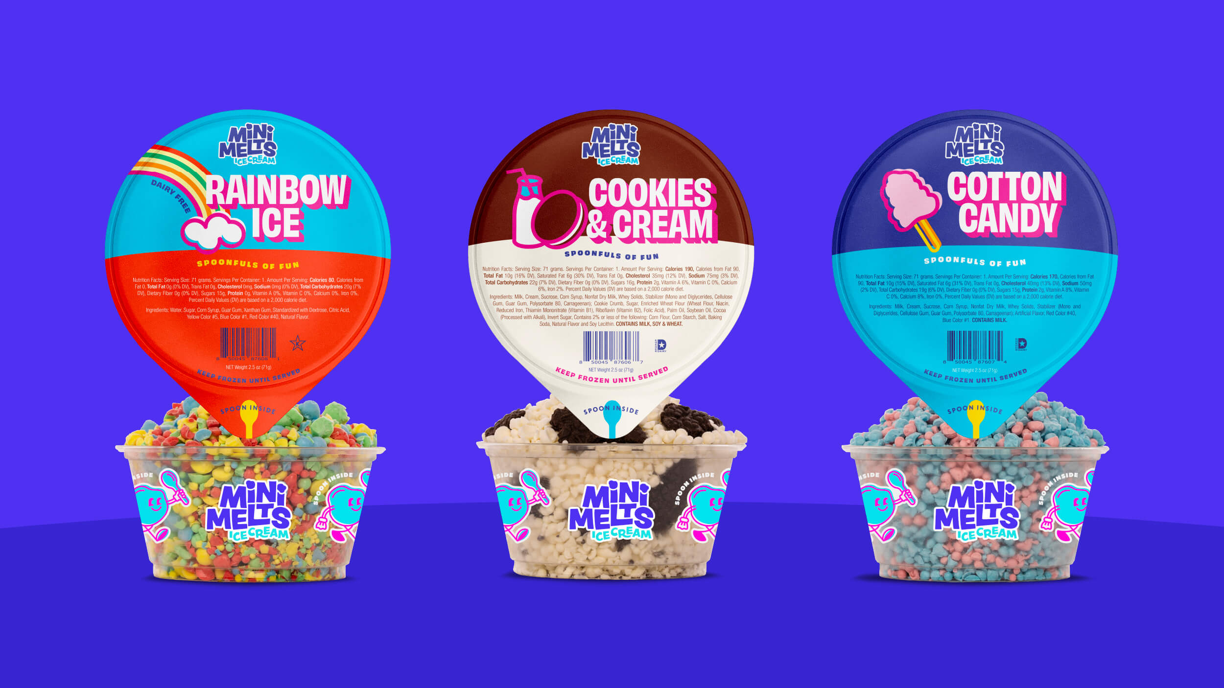
What should a mini beaded ice cream brand be? Fun. Vibrant. Joyful. All things that kids and kids-at-heart feel when they dive into a spoonful of fun with Mini Melts.
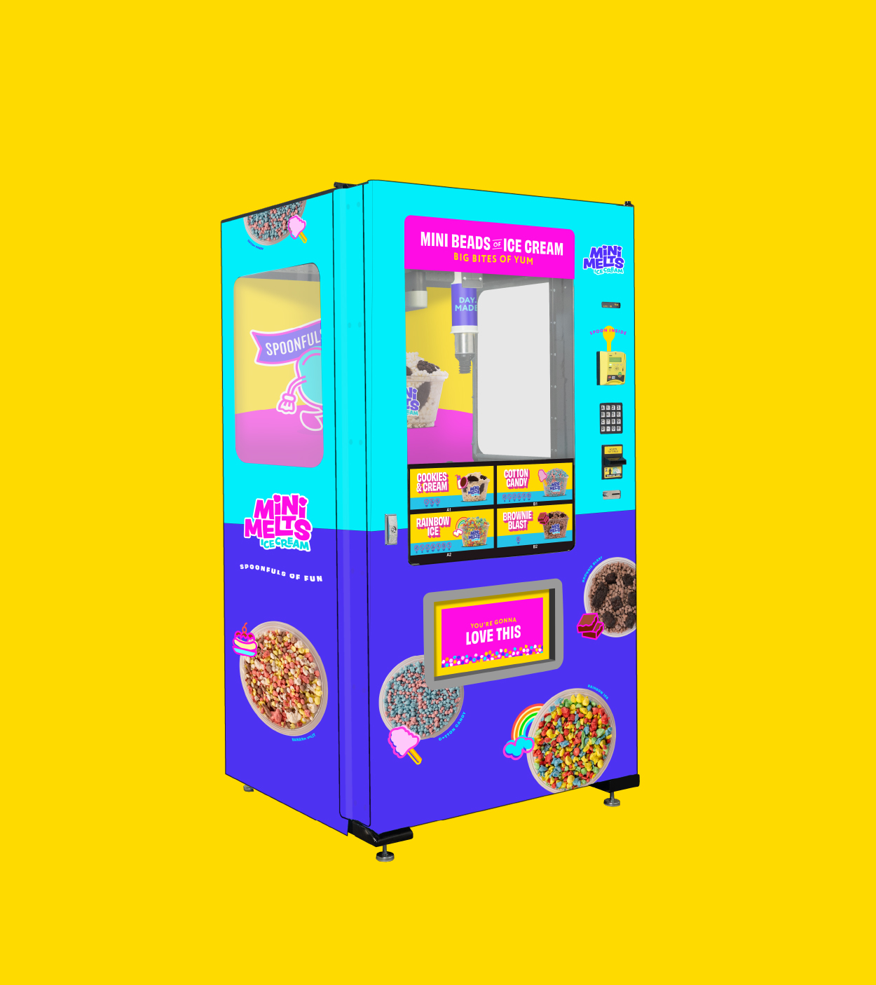
Mini Melts serves up premium beaded ice cream at convenience stores, stadiums, zoos and more around the country. With a 35% annual growth rate and a solid position in the frozen novelty category, it was time to refine their brand and connect more deeply with their ideal audience.
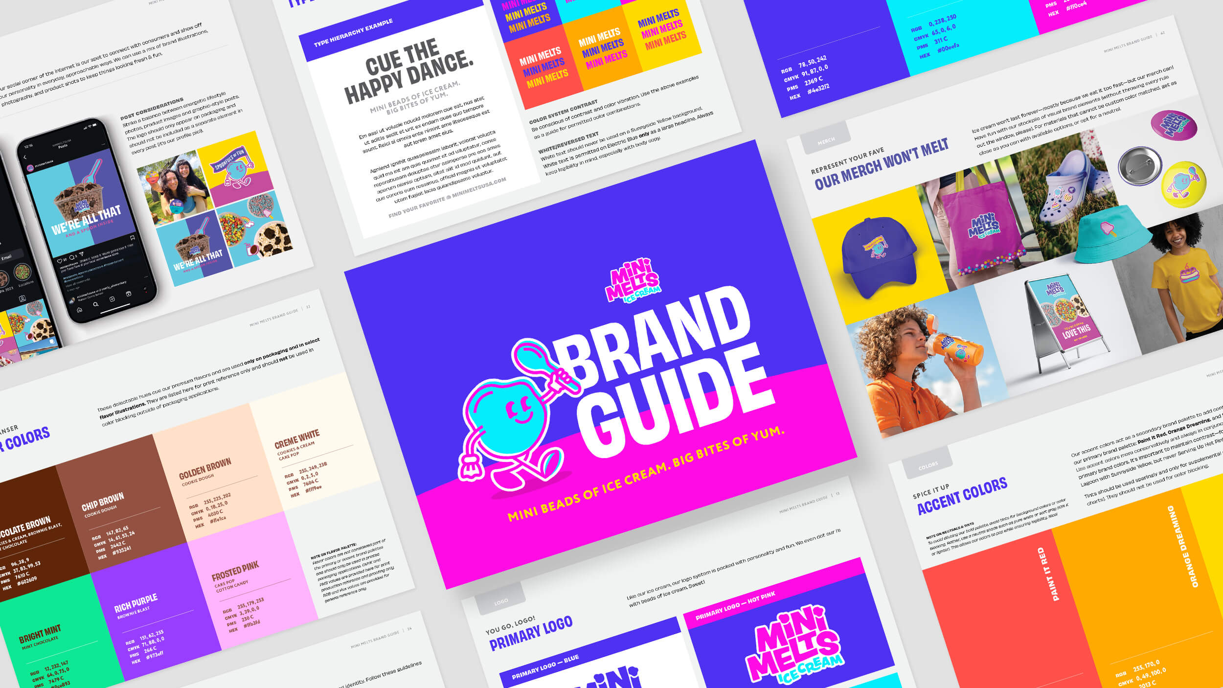
We started by digging into the brand, analyzing how Mini Melts stacks up against the competition, and talking with key stakeholders to uncover what makes the brand truly stand out in the market.
Mini Melts needed a fresh brand identity and logo that, like their ice cream, was packed with joy. Bold, blocky letters with a hand-crafted flair give the logo a playful personality you can’t help but love. Even the i’s are dotted with beads of ice cream.
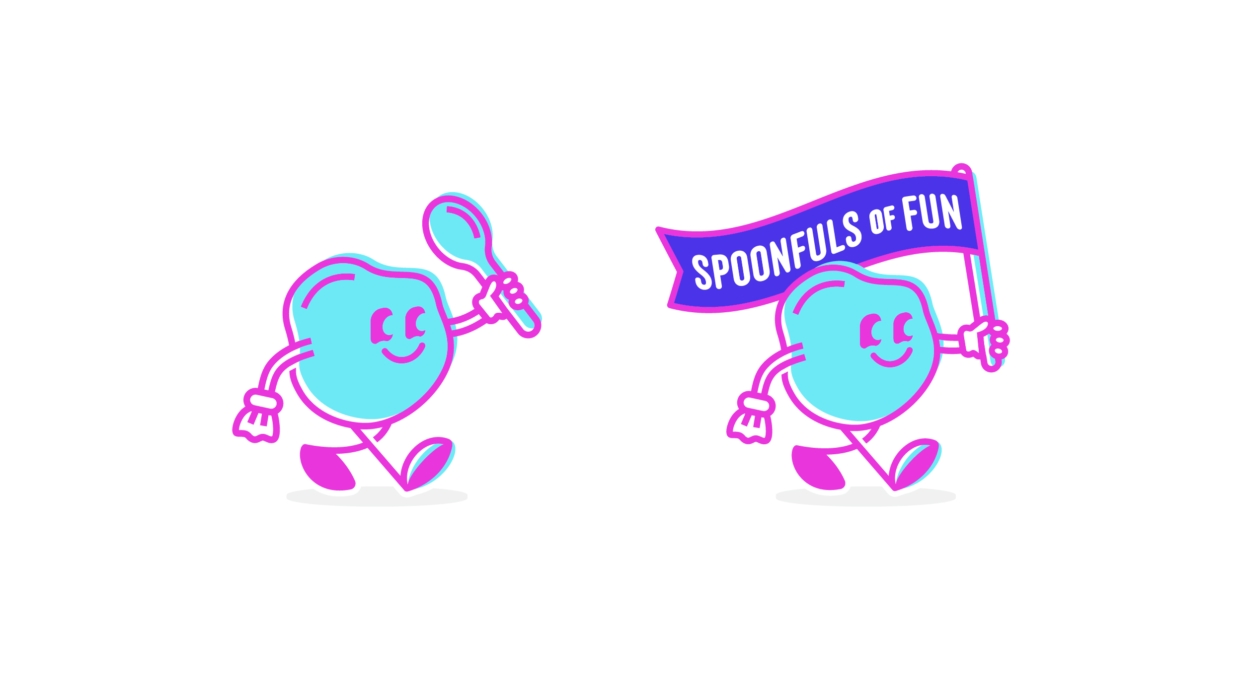
The logo is buddied up with a fun and friendly brand element that embodies the playful personality with a welcoming smile and (sometimes) the Spoonfuls of Fun flag to tell joyseekers, “This way to Mini Melts!”
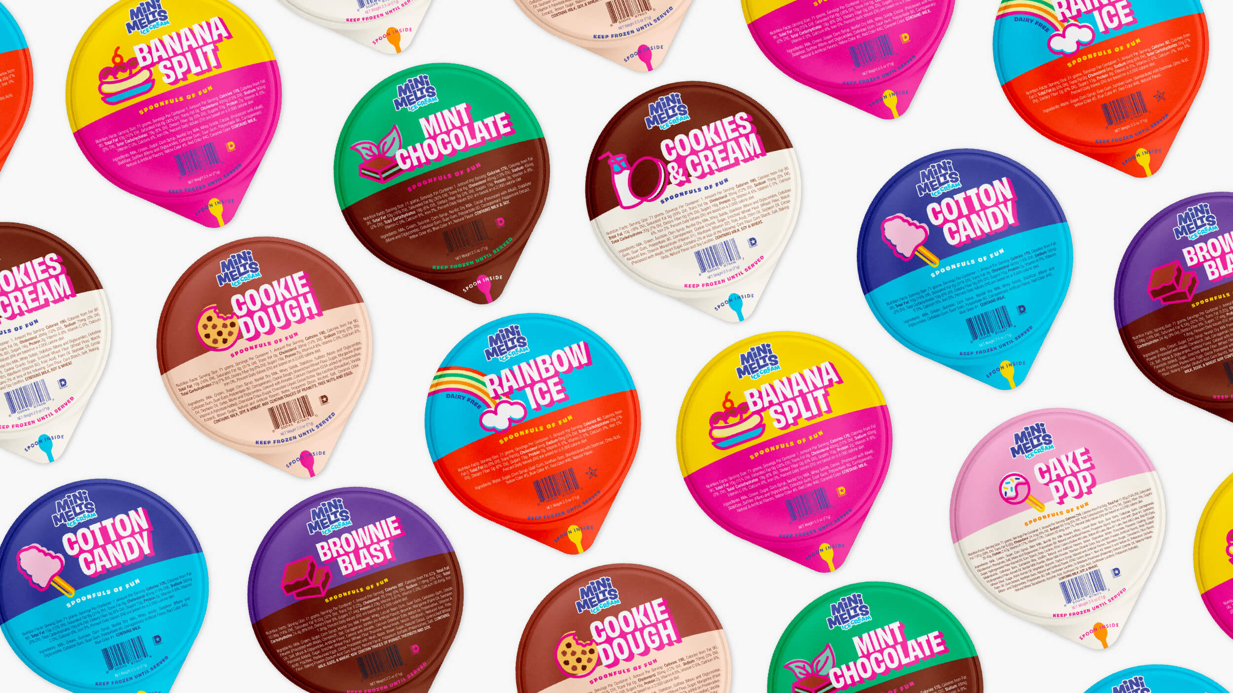
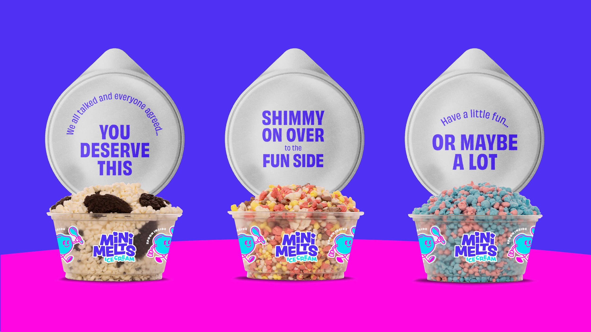
With poppy illustrations, a bold color palette, and an energetically joyful tone of voice, Mini Melts sparks joy and invites kids of all ages to treat themselves to a few Spoonfuls of Fun.